Description
I undertook a complete redesign of the Moneyboat portal with the primary goal of reducing inbound customer inquiries while enhancing the user experience by offering customers streamlined and intuitive access to their loan information. Acting as the sole designer on the project, I was responsible for overseeing all facets of the product design process, from user research and wireframing to prototyping and final implementation. My focus was on creating a sleek, seamless, and user-friendly interface that not only met the business objectives but also improved customer satisfaction by simplifying complex processes and interactions. This approach ensured a cohesive and efficient user journey that aligned with both customer needs and the company's operational goals.

The Problem
The problem with the current portal is that it is very outdated and not responsive for mobile. The experience is bland, the interface is clunky and it doesn’t really motivate customers to return and take out a new loan.
The Idea
We wanted to give it a fresh look and feel (new style guide), with improved user experience to help customers manage their loans, hassle free, and simple to understand with updated features.
The Solution
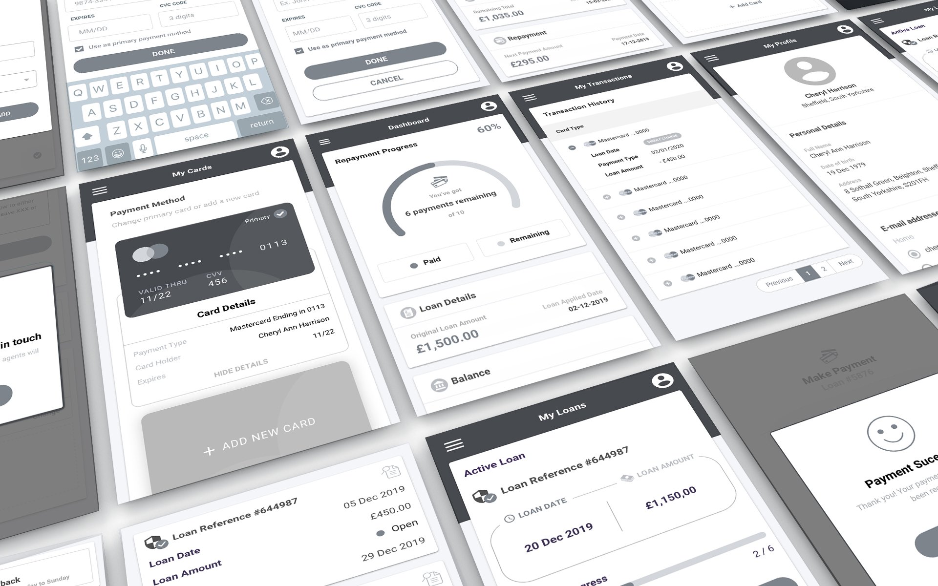
We developed a design that gives people answers before going to phone chat, saves employee time and allows them to get repayment information. The apps features increase lifetime value, and rate of new customers becoming returning customers.
Redesign Goals
The product is largely locked to a desktop presentation; over half of the audience is on mobile, so restructuring as a multi-device, is hugely important. The revamped design system will also allow other designers to make consistent and effective changes across all devices from this, and users will have a unified experience.
User Experience Goals
○ Simplify the experience to work consistently across all platforms without losing functionality.
○ Be consistent with inputs and functions.
○ Maintain visibility of the payment progress and notifications to show payment is due to minimise missed payments.
○ Increase confidence on each step to reduce input errors.
○ Be clear with the content hierarchy; titles, dates, subordinate items, microcopy, buttons.
○ Draw from real world concepts and patterns to increase user confidence.
Business Goals
In a nutshell: make it simple and fast, reduce missed payments, reduce support tickets, and increase number of returning customers.
Pain Points
○ Settings are difficult to find.
○ No clear hierarchy, inconsistencies across layouts and presentation.
○ Difficult to track progress and see when the next payment is due.
○ Notification for missed payments is not visible.
○ Not mobile friendly.
○ Built on old technology, lots of spaghetti, cumbersome to maintain.
User Flow
We worked on the entire dashboard/app flow which takes you from the entry point through a set of steps towards a successful outcome and final call to actions of the product. The aim was to make the user journey as smooth and pleasant as possible for the customer.

Sketches
After research we started sketching various sections for the portal. Main target on this stage is to create the right structure of the whole portal. Some of them stayed the same until the final version, while others changed a lot.
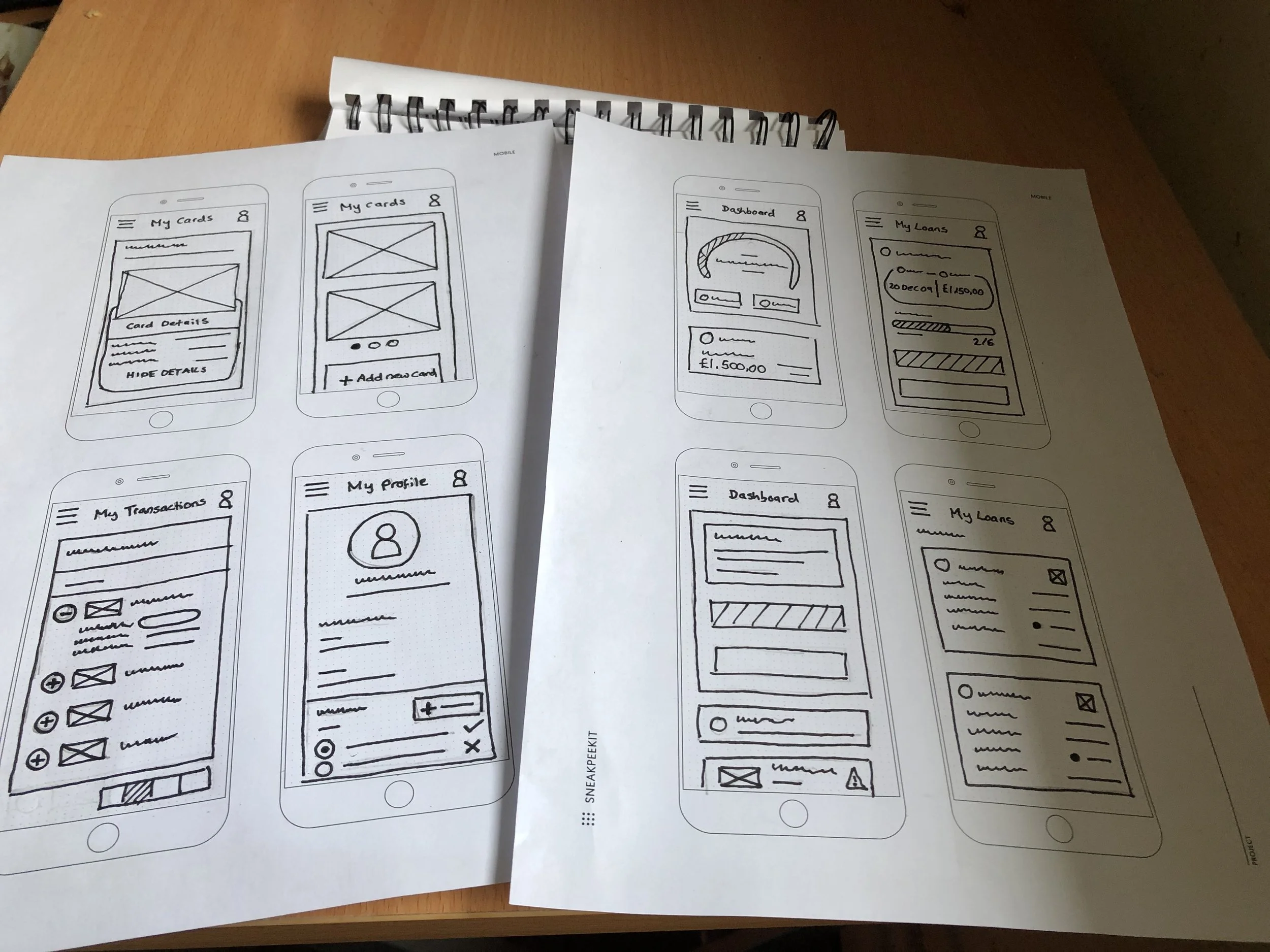
Wireframes
After finishing the sketching we started with wireframes. We tested a number of scenarios Main target of this stage is to solve complex challenges. These prototypes have been developed with the elimination of various problems and some of them are shown here.
Testing new interactions of app
Participant A
Positives
Loves the progress bar - very important as this helps to keep track of the payment process.
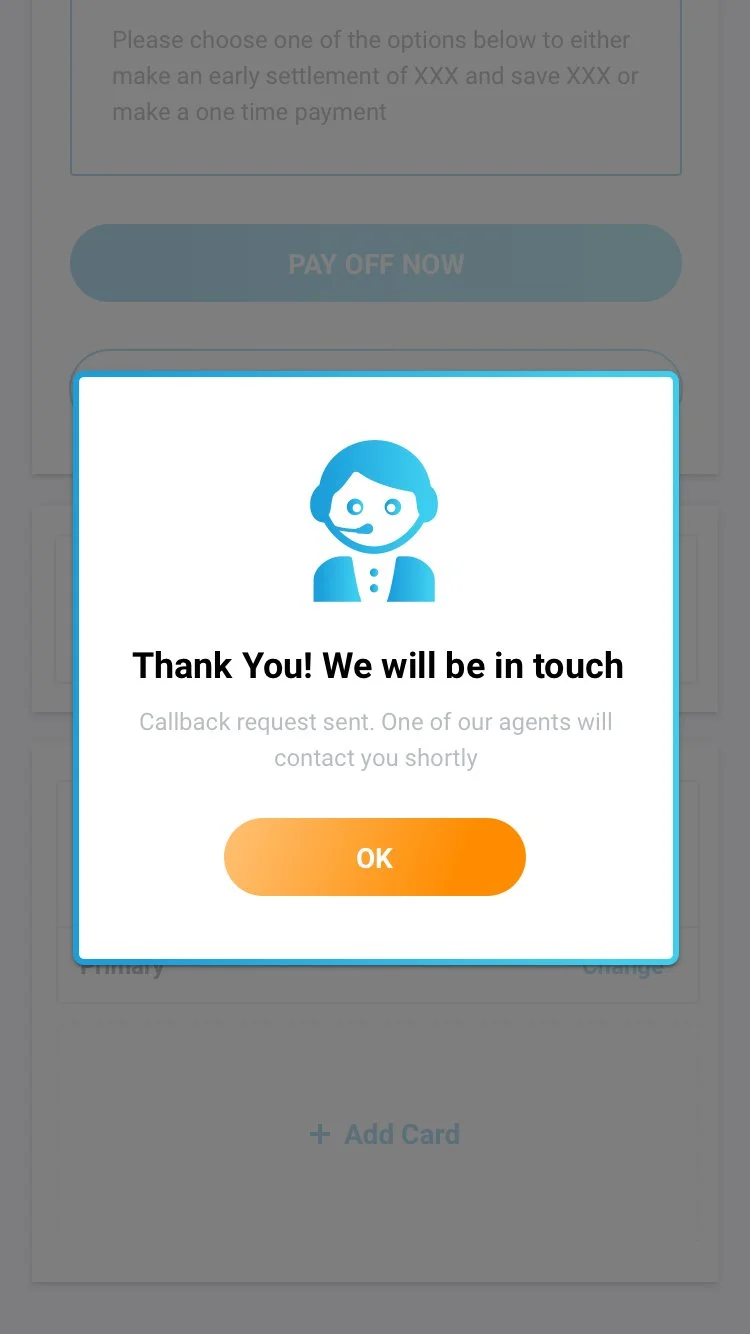
Having the “Request callback” button is useful. The customer feels reassured if any problems arise.
Easy to take out a new loan - the visuals and the prominent button encourage this.
Simple registration and login process. Easy to reset password.
The selection process is clear because of the usage of the bright blue colour - because of this, the user knows they cannot make a mistake.
Navigation is easy - information is sorted nicely.
Improvements
The information under the “My Loans” tab is a bit overwhelming and causing a lot of scrolling. Filtering out some of the unnecessary information will make it easier to digest.
Hard to differentiate “Active loans” to “Other loans”. It would be clearer if the icon was highlighted in another colour for other loans to indicate they have been completed, and keeping the active loans grey for still in progress.
Wasn’t sure which payment methods were available under the “My Cards” section.
Ability to remove a payment method (card) would be nice.
A bit of confusion in regard to the difference between “Pay off now” and “Make a one time payment” buttons. Add some information here - how much would the customer save?
Some of the icons used are a bit confusing as they don’t convey what they do - try different ones
Participant B
Positives
The layout of the dashboard is clear, it highlights the key information at the top of the page.
Missed payment alert is prominent. The format gives it a visual way to notify the customer that a payment has been missed.
The quirky pop ups are great, they keep the user reassured and engaged.
It’s clear to see where you would make a payment.
Improvements
Buttons to be orange instead of blue.
Information on the “My Transactions” tab is shown clearly but the user would like the ability to load all transactions at once instead of having to go through each page using the pagination.
Notification for late payment to be sticky.
“My Cards” and “My Transactions” icons are too similar. Can cause confusion as a result.
At first the user was unsure how to change their payment method. It would help if there was a confirm button or once a card has been selected or have a confirmation popup.
Would change the order of the layout on the page and move the call to action section below the loan details as this should be the first step in the process.
The loan details are a bit hard to tell apart - changing the colour of the £ amount to blue and/or making the font bigger will help to make it clearer and improve the readability.
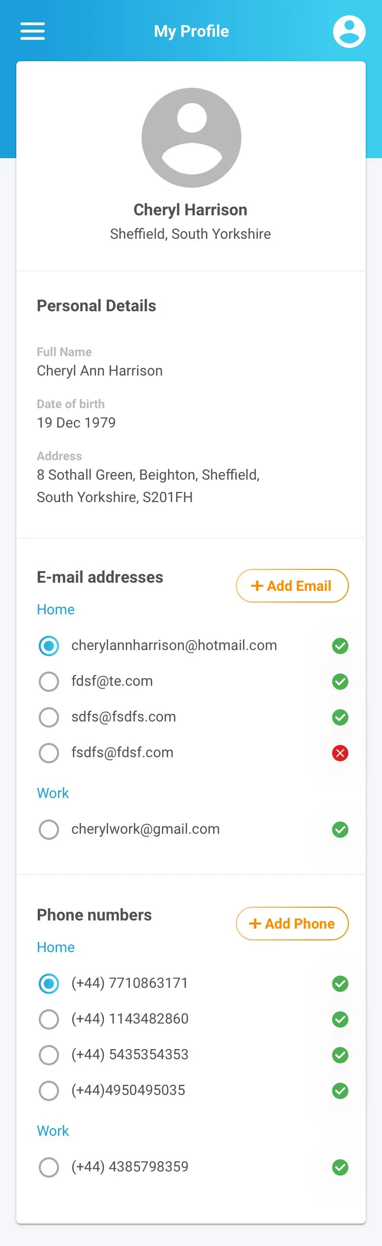
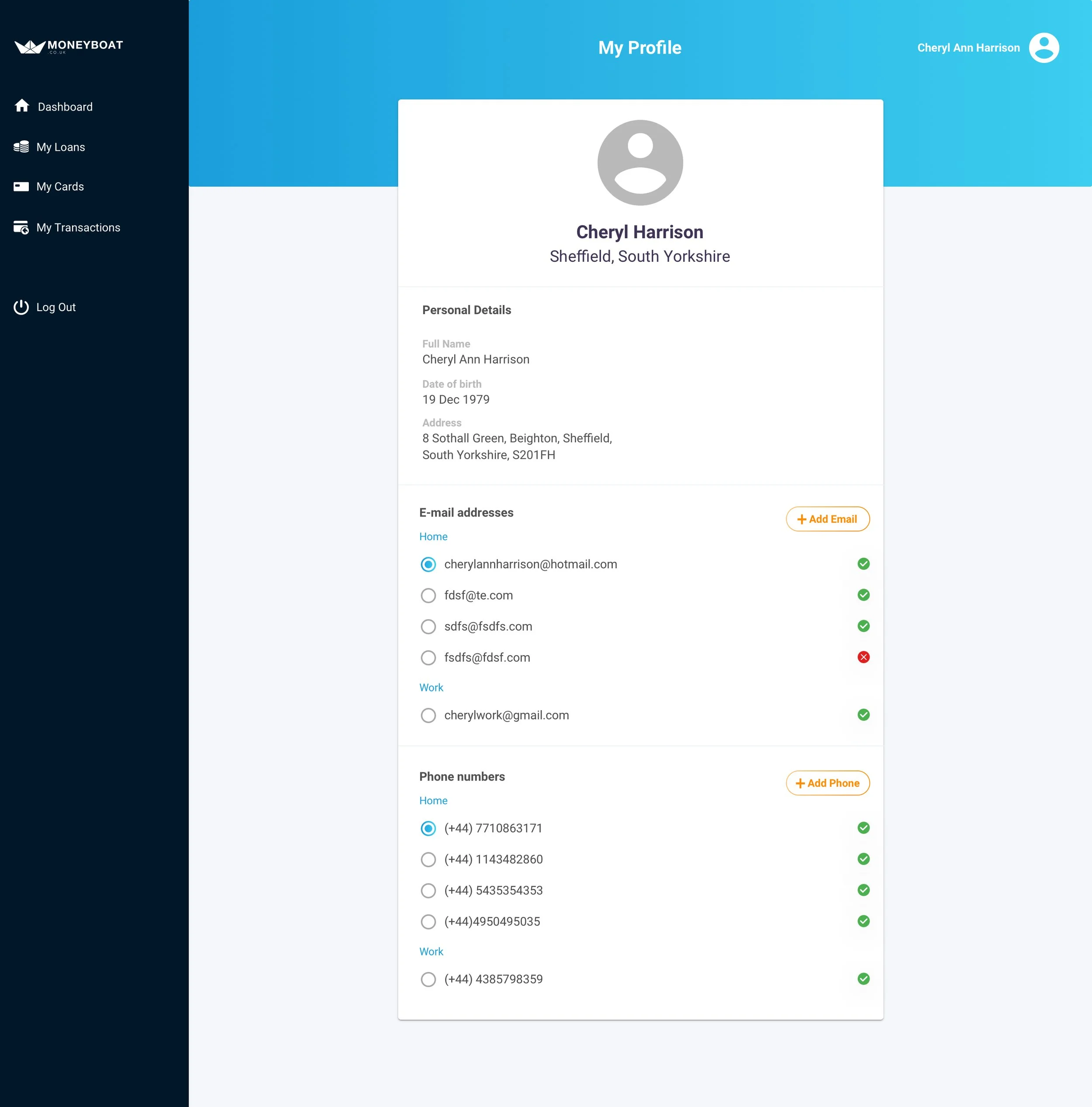
Style Guidelines

The Result
The new designs successfully decreased “missed payment rates” and the new dashboard provided answers quicker to customers which made the Customer Support and Collections Team more efficient.