
The goal of the new design system
Harvey Nichols needed an updated design system to streamline their digital presence and maintain a consistent brand identity across all platforms. As a luxury retailer, their customers expect a polished, cohesive experience, whether they're shopping online or engaging with digital touchpoints. A design system provides a centralised library of visual elements—such as colours, fonts, styles, grids, icons, and components tailored to the Harvey Nichols brand.
By organising these assets into a well-defined system, it ensures that both designers and developers work efficiently and consistently. Developers can quickly reference the library when building or updating digital products, reducing redundancies and minimizing errors. This not only saves time but also ensures that every part of the Harvey Nichols digital experience reflects the same high-quality, luxurious feel that the brand is known for.

The Challenge
Every time we began a new project or entered a new phase, we were essentially starting from scratch. This meant setting up a brand-new component library each time.
As a result, we ended up redesigning the same components repeatedly, with styles changing each time to match the specific functionality.
What we needed to do was:
Rebuild existing components
Collect all previous use cases and create new ones for each component.
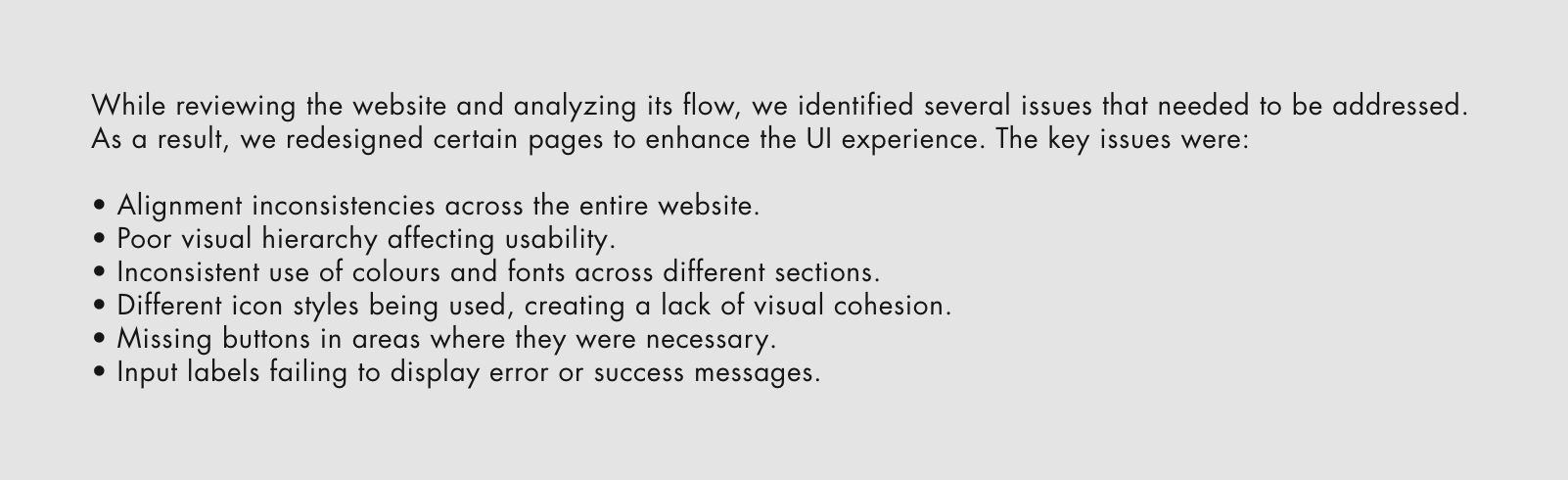
The first step was exploring the website and navigating its flow to gain a general understanding.

The Approach
I started with a lot of research. I read articles and reviewed the design guidelines laid out by other brands including Google Material Design, Carbon Design System etc.
We proceeded by creating an evolving set of components following the principles of Atomic Design. Collaborating closely with developers, we ensured that naming conventions and component organisation were effective for both teams. The Design System was mirrored in Storybook, and this collaborative approach helped streamline the entire process.
In this section, I thoroughly reviewed the entire website, set my goals, and followed the outlined process. However, I encountered issues on several pages due to inconsistencies. I documented all the areas that required redesign.
Building the Design Foundation
At that point, we had everything ready, so we began with the design foundation. It consisted of colors, typography, buttons, grids, styles, imagery, icons, sliders, accordions, chips, notifications, forms, carousels, navigation tabs, and more. First came the typography. Some existing typefaces were updated to better align with the design goals, while others were deemed unnecessary and removed. New typefaces were also selected, along with decisions on font sizes and appropriate weights for each element.

Next, we focused on the colours, categorising and organising them based on their functional properties. In this product, black took prominence and was designated as a primary colour. Secondary colours were chosen to complement the primary colours, adding depth and visual balance to the design. Tertiary colours were utilised sparingly to highlight specific elements and add subtle accents without overwhelming the overall palette.

The website was designed and structured with a properly aligned layout to ensure a cohesive and professional appearance. The grid system was strictly followed to maintain consistency in spacing, alignment, and proportions across all elements. This involved using appropriate margins, padding, and column widths to create a visually balanced design that improved readability and enhanced user experience.

Websites are composed of various elements that enhance both their functionality and visual appeal. In addition to text, they also incorporate icons of varying pixel sizes, which serve different purposes. Icons are visual representations that help convey information quickly and intuitively. These icons may appear as navigation aids, buttons, social media links, or decorative elements. Given the luxury nature of Harvey Nichols, we designed these icons to reflect sophistication, incorporating minimalist and elegant designs.

The Atomic Design methodology organises UI components into three key levels:
Atoms: Basic building blocks like buttons, input fields, or labels.
Molecules: Groups of atoms working together, such as a search bar combining a text input, button, and label.
Organisms: Larger structures formed by molecules and atoms, like a website header with a logo, navigation bar, and search bar.

At Harvey Nichols, imagery plays a pivotal role in crafting a visually compelling and aspirational online and in-store presence. This guidance can be tailored to the brand and utilised in various digital formats such as hero images, grids, and carousels.

Results
The design system at Harvey Nichols improved consistency across digital platforms, streamlined design processes, and enhanced user experience with intuitive navigation. It boosted engagement, increased conversions, and supported collaboration with reusable assets, solidifying the brand's premium and innovative image.