
Project Overview
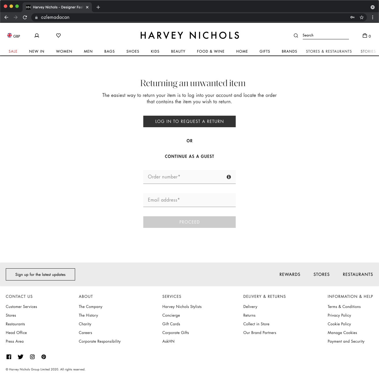
Harvey Nichols didn’t have a returns portal, which meant customers had to rely on customer support to process their returns. This manual approach not only made the process slower and less convenient for customers but also put a heavy burden on the support team, taking up time and resources that could be used elsewhere.
As a UX designer, one of my key tasks was to create a returns portal from scratch. The goal was to make returning items easier and faster for customers while reducing the workload on the support team. This project involved understanding the pain points of both customers and internal teams, designing a solution that was intuitive and efficient, and ensuring it aligned with the overall brand experience. The returns portal ultimately aimed to improve customer satisfaction and optimise internal processes.
Core Problems
• Customer Inconvenience: Manual returns are time-consuming and frustrating, reducing satisfaction.
• Increased Support Load: More reliance on customer service increases costs and delays.
• Tracking Issues: Lack of transparency and errors in return tracking can cause disputes.
• Customer Retention Risks: A poor return experience discourages repeat purchases.
• Operational Inefficiency: Manual processes slow refunds and are hard to scale.
Gathering Requirements
I facilitated hands-on workshops with stakeholders to gather requirements and establish alignment on priorities. Additionally, I collaborated with engineers to validate the feasibility of these requirements within the BigCommerce platform. This collaborative approach ensured alignment among all parties and resulted in a final design that effectively met both user and business needs.

User Journey Mapping
I used Miro to map out the user journey, providing a clear visual representation of user actions and touchpoints across different stages. By collaborating with my team through Miro’s interactive features, we identified pain points and opportunities, which led to actionable insights and a more user-centric experience. This iterative process, paired with stakeholder feedback, helped create a roadmap that aligned our solutions with user needs.

Wireframe (Low-Fidelity)
Collaborating with stakeholders through two rounds of amendments helped refine the design and improve clarity around the creation flow. The wireframing phase allowed us to address feedback early, ensuring the flow aligned with both user and business needs.
The process also brought attention to recurring challenges faced by the support team. By addressing these issues in the design phase, we implemented effective solutions upfront, making the final process more efficient and user-friendly.


Wireframe (High-Fidelity)
The entire creation process was reconfigured to reduce the steps needed by nearly half without removing any functionality. The messaging for every step was made consistent and clear, tools were moved to more logical locations, and the process is visible every step of the way. Additionally, a solution was designed to enable guest users to return products effortlessly.


Additionally, a solution was designed to enable guest users to return products.

User Testing
We conducted user testing to identify pain points in Harvey Nichols’ return process and gather feedback for improvement. The focus was on understanding return reasons, evaluating communication, and assessing the usability of the returns portal. Insights from this research aimed to optimize the experience, aligning it with customer expectations and boosting satisfaction.
• What were the main reasons you decided to return your purchase at Harvey Nichols?
(Probe for clarity: Was it sizing, product not matching expectations, quality concerns, or other reasons?)
• Did you receive clear and timely updates about the status of your return?
If no, could you describe where the communication fell short (e.g., delays, missing information)?
• How easy was it to find and understand Harvey Nichols’ return policy and process?
Were there any parts that seemed unclear or confusing?
• Were there any aspects of the returns portal that felt frustrating or challenging to use?
(Example probes: Navigation issues, too many steps, lack of progress tracking?)
• Did the portal meet your expectations for efficiency and ease of use? If not, how could it improve?
• Based on your return experience, how likely are you to shop again at Harvey Nichols?
How It Will Impact the Business
Positive Word of Mouth: Happy users are more likely to share their experience with friends and family. This can bring in new customers through recommendations.
Lower Return Costs: A better returns process can make handling returns easier and less expensive, even if it isn’t directly linked to UI changes.
Improved User Retention: When users have a good experience, they are more likely to come back. This helps grow the customer base over time.
With paperless returns, Harvey Nichols should save approximately 441k sheets of paper and 350k labels a year, doing our part to be sustainable for staff and customers.
My Insights
Using Data to Make Decisions: This case study shows how important it is to gather and use data to improve the website. This approach can also help in other parts of the business.
Real-Time Tracking: Adding real-time tracking for returns helps solve a common user problem and makes the process more transparent.
Better Retention Rates: By giving users a better experience, they are more likely to return for future purchases, which supports long-term growth.